Why Shade Range Should Be an Animated Statement
Admigos creates spectrum-based shade stories with inclusive beauty animation. Show your full range with foundation shade visuals that move, blend, and connect.
11 Jul'25
By Niharika Paswan

Why Shade Range Should Be an Animated Statement
When someone scrolls past your foundation ad, they shouldn’t wonder if you offer their shade. They should see it: clearly, confidently, and in motion. Because in today’s beauty landscape, your shade range isn’t just a SKU list. It’s a message. A promise. A point of connection. And the fastest way to make that connection is with animation.
Static swatches are fading. Grid posts get swiped past. But a seamless melt from fair to deep, a real-skin gradient, a pigment reveal that feels human? That stops the scroll. The right motion tells a fuller story: not just what you sell, but who you’re for.
Beauty buyers aren’t just looking for inclusivity, they’re expecting it. And to deliver that visually, brands need more than a color bar. They need gradient storytelling.
Let’s explore why shade range deserves movement, how animation can humanize your spectrum, and why now is the time to shift from swatch posts to something more real.
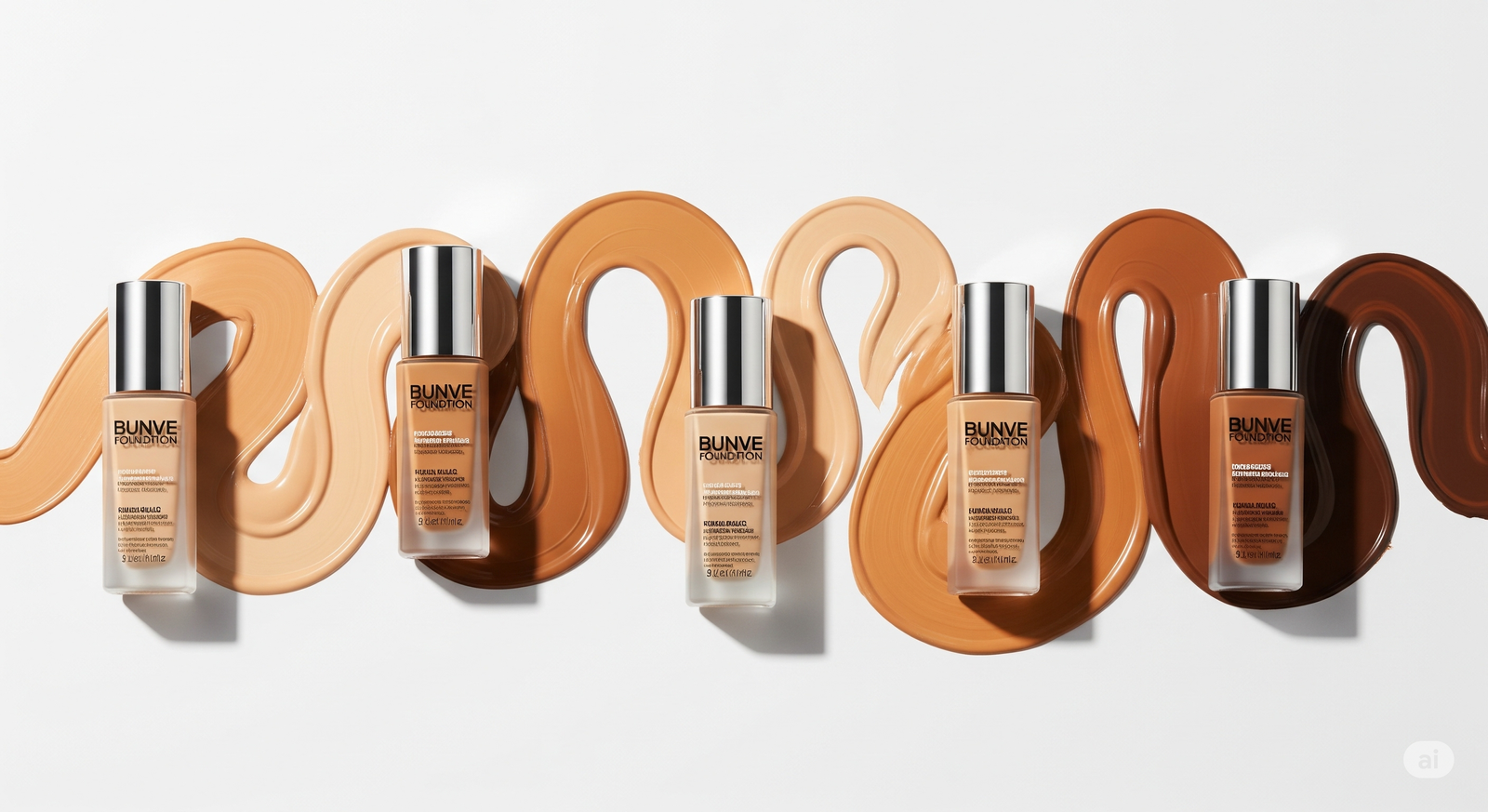
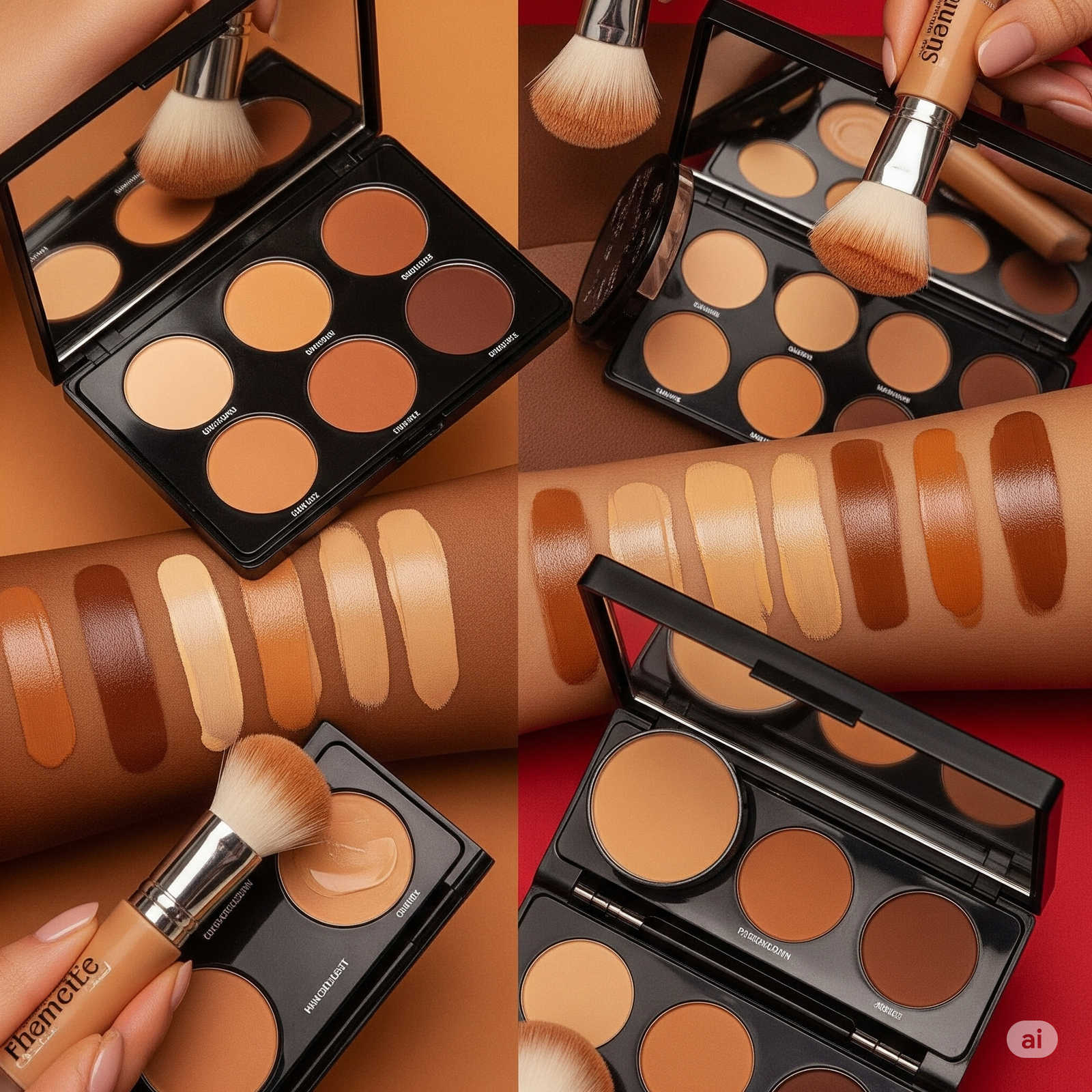
A Shade Range Isn’t a Lineup: It’s a Language
Your shade range is more than a product feature. It’s a visual vocabulary. One that signals care, presence, and respect. It shows you understand undertones, skin shifts, real people. When you animate that language, you create a feeling and not just a chart.
Static grids can’t do this:
- They flatten nuance
- They often misrepresent tone due to lighting
- They reduce real skin to pigment blocks
- They center design over emotion
Animation, on the other hand, breathes life into shade stories. It lets you show how foundation moves across undertones, how it warms on deeper skin, how it diffuses or brightens or melts in and not just sits on top.
It makes the statement: this product wasn’t made for skin types, it was made for skin realities.
Gradient Storytelling: How Motion Changes Everything
The difference between swatching and storytelling comes down to flow.
With gradient motion:
- You move across skin tones instead of cutting between them
- You create a narrative arc: from one end of the spectrum to the other
- You let each shade linger, highlight, and breathe
- You show not just color but finish, light play, and blend
Gradient animations allow viewers to emotionally enter the range. They don’t have to decode labels like “tan neutral 4” or “deep golden 7”, they see it. In real-time. With real texture. That emotional entry builds trust faster than any shade name ever could.
Inclusivity in Motion Feels Intentional
Too many brands still treat inclusivity as an afterthought, an extension of their hero shade. But viewers know the difference between a shade range that exists and one that was built with purpose.
Motion allows you to show purpose.
- Shades aren’t tacked on, they’re centered
- The full range gets equal lighting, space, and movement
- Deep tones aren’t just last, they’re celebrated with rhythm
- Neutral, olive, cool undertones all get moments in frame
This matters. Because inclusivity isn’t just about how many shades you offer, it’s about how you present them. Are deeper tones lit with care? Do mid-tones feel like a default, not a midpoint? Does your animation avoid flattening or over-correcting?
Motion gives you the tools to answer “yes.” And that yes resonates, especially with beauty shoppers who’ve felt ignored by flat visuals for too long.
Admigos Creates Spectrum-Based Shade Stories
At Admigos, we believe every tone deserves its own moment. We build inclusive beauty animation that showcases shade range with emotional accuracy, real-skin simulation, and finish fidelity.
Whether it’s a sweeping foundation curve, a blend-to-match arm reel, or a zoomed pan across real complexions in sequence, we animate shade in a way that feels felt and not just seen.
We use 3D lighting, pigment mapping, and fade transitions to bring full-spectrum products to life. Because beauty isn’t one tone and neither is good design.
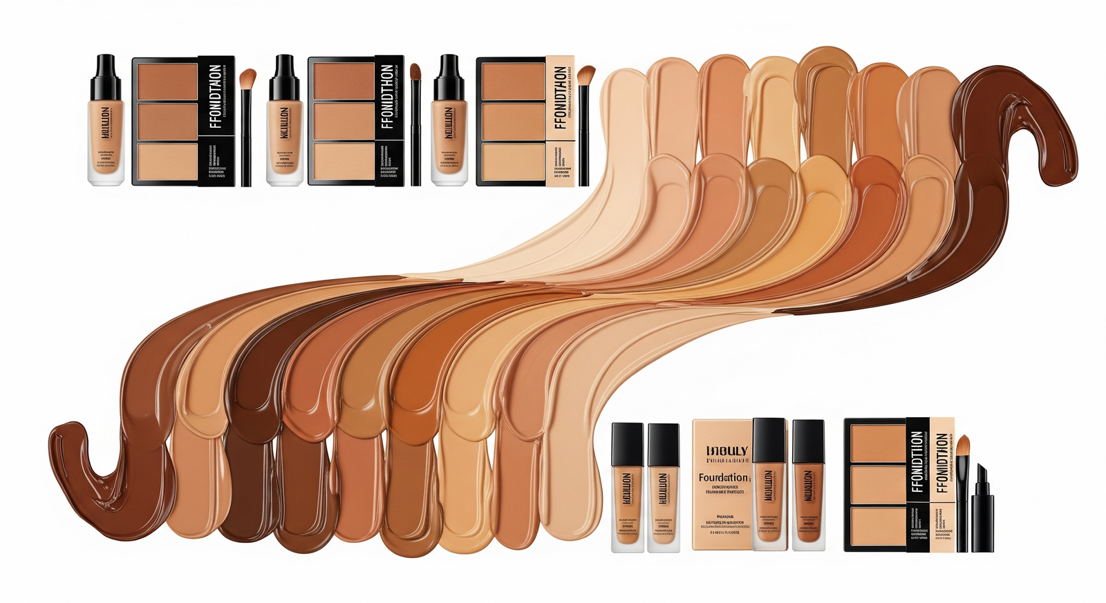
Formats That Bring Shade Ranges to Life
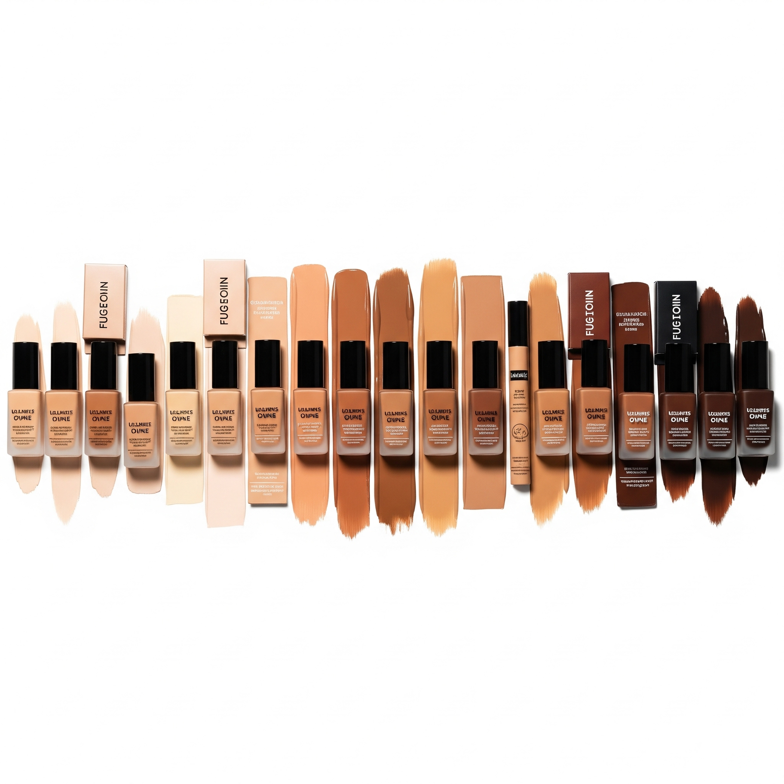
Here are a few high-performing animation approaches to consider for foundation or base products:
1. Seamless Fade
A loop where one skin tone melts into the next, with textural continuity and pigment tracking. Works beautifully as reels or background visuals on landing pages.
2. Swatch in Motion
Instead of static swipes, show pigment being applied: stick, dropper, brush on real skin. Then fade to the next tone in the same movement. The continuity creates trust.
3. Gradient Arc
Use circular or crescent layouts to show the full range like a color wheel, not a chart. Let tones orbit, pulse, or glow subtly to suggest harmony.
4. On-Face
Transition Show one face subtly morphing into others across the range. Or use side-by-sides where skin texture stays constant but pigment and undertone change.
5. Texture Reveal
Instead of focusing on the color itself, show the finish: matte to radiant across tones, powder vs. cream, blur vs. dew. Let the experience of the shade come through.
The best animations don’t just show color, they show care.
Why This Matters More Than Ever
Representation fatigue is real. Shoppers are tired of “diversity” being a checklist. They want shade ranges to feel natural, embedded, real. Animation can help build that feeling not through marketing copy, but through visible proof.
When you animate inclusivity, you:
- Center the user instead of the product
- Build brand equity in a competitive category
- Reduce the uncertainty of online shade matching
- Turn your shade range into a visual signature
This isn’t just an equity move. It’s a conversion strategy.
When people see themselves reflected accurately, beautifully, intentionally they believe the product was made for them. And belief sells.
Moving Forward: Don’t Just Display Shades, Tell Them
If your shade range lives only in static swatch pages, you're underselling your work. You're hiding the care your formulation team put in. You're letting your most inclusive feature sit flat.
Let it move!
Let it pulse, flow, breathe. Let your deeper shades shine first. Let undertones carry arcs. Let warmth show through. Let your product meet people before it touches their skin.
Because today’s beauty buyer doesn’t want to guess where they fit.
They want to see it. In motion. In real tone. In soft light.
And once they do, they don’t just see your brand. They believe in it.
Beauty Products as Objects of Desire | Desire-Led Skincare Animation
Discover how slow-motion gloss, hero lighting, and symbolism turn beauty products into objects of desire.
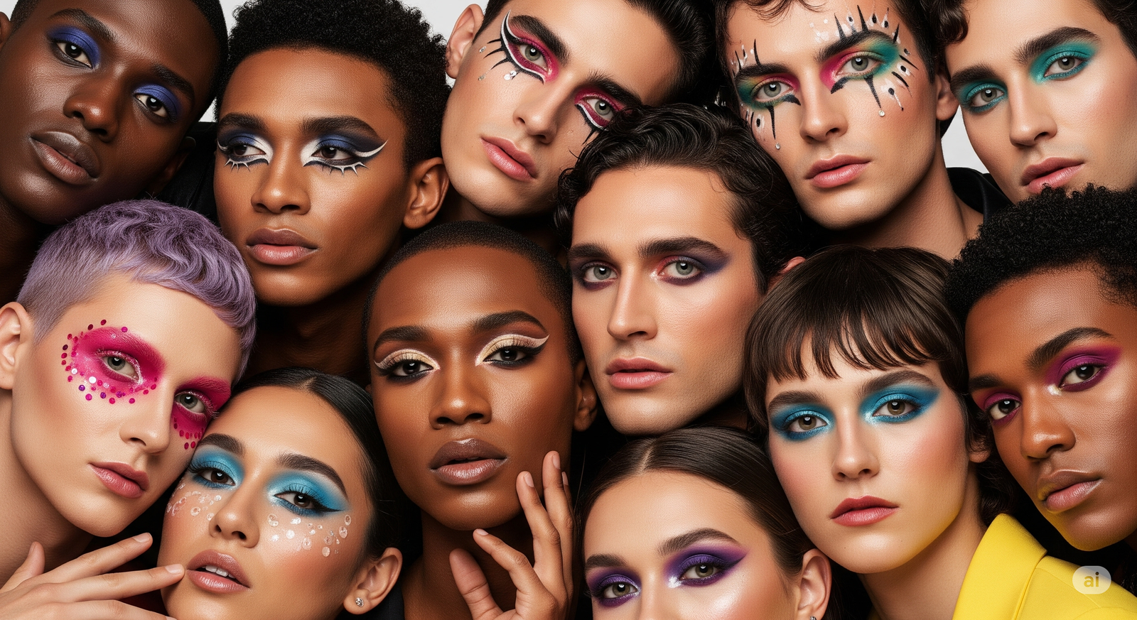
Makeup for All Genders: Motion That Breaks Binaries
Admigos animates identity, not categories. Explore how gender inclusive makeup visuals and motion storytelling break beauty binaries across shade and style.